Summer vacation. These two magical words conjure up all kinds of pleasant imagery for me: days at the beach or by the lake, lounging in a backyard hammock reading a good book, BBQs, capris and iced teas. But for those who love art, we imagine a summer where our greatest wish is fulfilled either through a regular collection we haven’t seen before or a special exhibition that was really all that.
For me, the ultimate summer excursion is visiting a museum that finally left me wanting for nothing. To be free of wishing a museum’s collection was different, better, larger. Or that a collection hadn’t left out a specific artist, time period, style or genre.
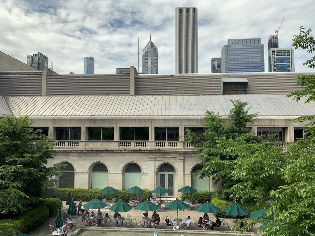
After a road trip with my wife through the Midwest, walking cobblestone streets in Germantown in Columbus, Ohio or lounging by the stream at the cider mill outside Detroit, the summer of our complete content was realized at the Art Institute of Chicago. I had visited the Art Institute once before, but was so overwhelmed by the awesomeness of the collection that I was like a woman drowning, overwhelmed, floundering. But by my second visit, I found my bearings.
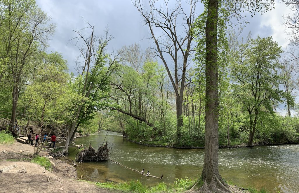
After spending several days driving through the Midwest visiting family, we pulled into Chicago on a summer day spitting its dreary mist at us, not fully committing to rain, aka a perfect summer museum day.
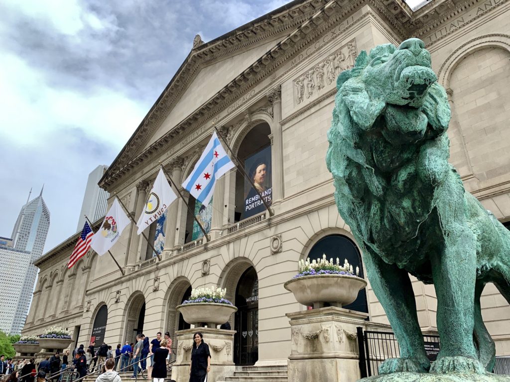
Two imposing lions greeted our entry as the Magnificent Mile loomed a couple of blocks away. Inside the museum, we were energized by art so spectacular that we felt more and more lively as the afternoon went on.
Our first visit was to the impressionist part of the museum where I got to revisit my childhood in Ohio. When I was growing up in Lorain, a small steel town on Lake Erie, I spent too many days confined to the guest room away from the rest of my family getting through all those childhood illnesses: chicken pox, measles and mumps.
A modern aside: I got these illnesses because they were rampant in the mid-1960’s, even though I was vaccinated. As I endured the parade of diseases, my only companion as I recovered in bed was a canvas reproduction of Pierre-Auguste Renoir’s Two Sisters (On the Terrace) (1881). As I coughed or scratched or napped, my anchor was always that painting.
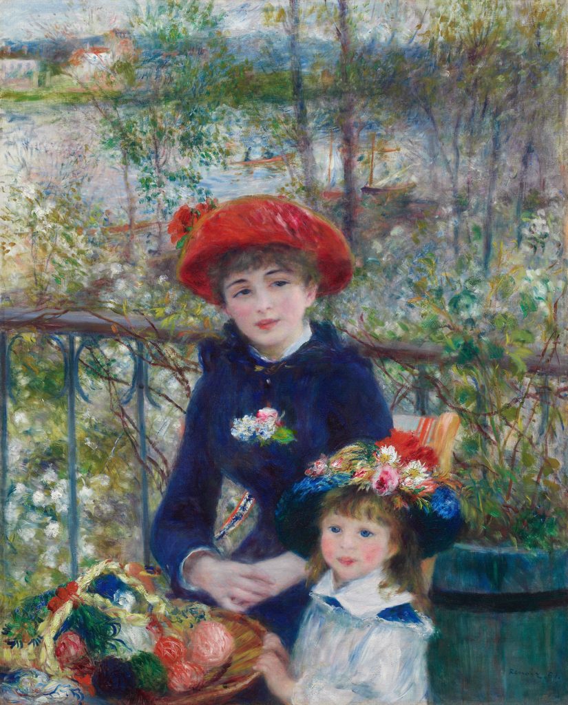
The younger sister appeared to be looking squarely into my eyes: a friend, a co-conspirator, close to my own age. I would watch her, comparing myself to her, my first experience as a girl sizing myself up to the other females who would weave in and out of my childhood. The girl in the painting and I had similar hair color and blue eyes, but I lacked her fancy hat made of big blossoming flowers. My only hat was a well-worn washcloth my mother placed across my feverish forehead.
In the painting, the older sister’s gaze is fixed away from the viewer, a half smile revealing a private joke only she is privy to. As I rolled around in sticky feverish sheets, I desperately wanted to know what or who she was smiling at. It was just out of view, whatever or whoever it was, just like the mythical world of adults, the tribe I would join many years in the future.
So to be walking through the Art Institute of Chicago on a dull day and to come face to face with Renoir’s actual painting, not a reproduction, was to experience my own invincible summer. The brilliant colors of the girls flowers, the colorful cornucopia of yarns cradled between the two of them made any concept of 4K or 3D seem shabby by comparison. The colors in the oil painting were as deep and jeweled toned as if Renoir had painted it yesterday.
And I took full advantage of modern technology to examine the painting in detail, using portrait mode on the latest iphone to take closeup snaps of Renoir’s brush strokes: the gradation of blue in the young girl’s hat as it blended from midnight to navy to cobalt or the blush of burgundy which appeared from a delicate dab of Renoir’s brush in the middle of a pale pink flower.
I also studied the thin frantic lines that made up the balls of yarn gathered between the two sisters. Renoir rendered them none too carefully, all round haphazard joy.
NOTE: After I returned home, I looked at my photos and was impressed that portrait mode on my iphone allowed me to take photos which showed every brush stroke. I’m hoping to get approval from the Art Institute of Chicago to show my photos here. At this moment, I’m posting their pre-approved photos for reference as well as links to their pages in certain cases due to copyright issues.
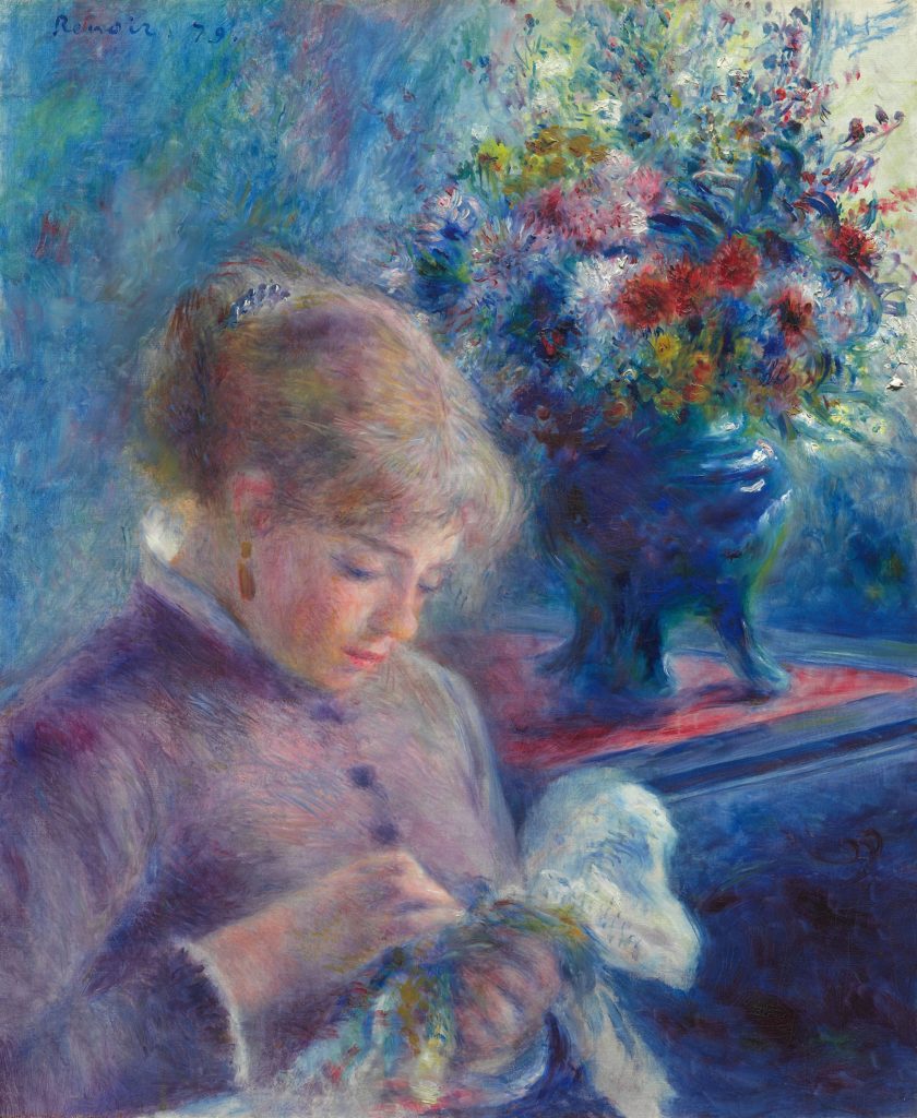
My wife and I also enjoyed other works by Renoir including Young Woman Sewing (1879) where Renoir took full advantage of a comforting pallette, an entire spectrum of blues blended with dusty rose and the browns of late summer flowers.
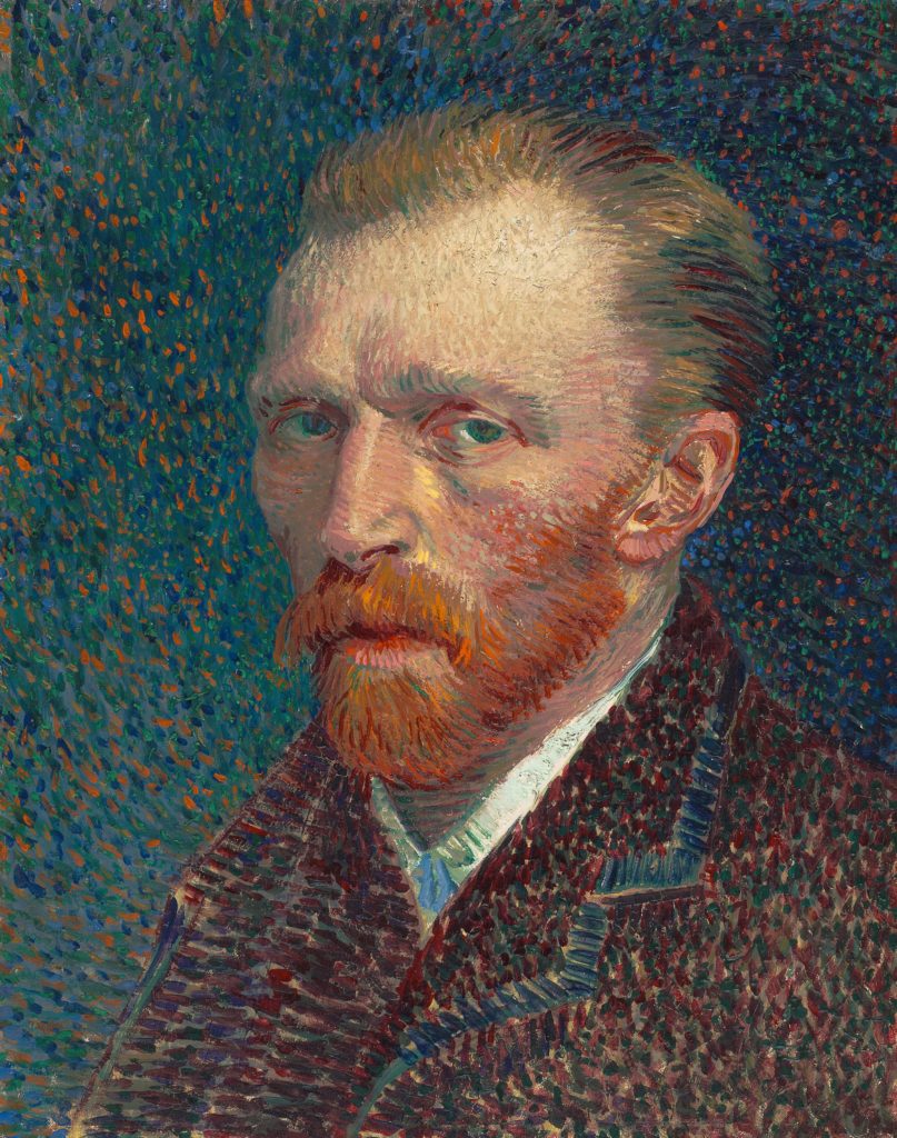
When we turned a corner among the impressionists, haunting eyes called out to us, and we came face to face with Vincent Van Gogh’s Self Portrait (1887). Instead of the thick brush strokes of the earlier impressionists or the soft natural monochromatic colors, i.e. shades of the same color blended according to the light source and artists’ perspective, Van Gogh’s technique truly felt contemporary, a painting for the digital age.
The entire artwork was produced with short brush strokes creating a feeling of pixelation, like an image trying to download over a slow internet connection, trying to render all of its pixels. The painting technique felt oddly fresh and tickled the Twilight Zone part of my brain, making wonder if Van Gogh’s madness was a result of him being from the future?
The background of the painting featured hundreds of dots in dull blues and greens, hints of orange, which was a nice contrast to the pale skin, red hair and brown jacket of Van Gogh himself. Even Van Gogh’s jacket is pixelated with short brush strokes in every shade of brown from chestnut to beige to rust, an image, a person trying to sharpen, focus, or download.
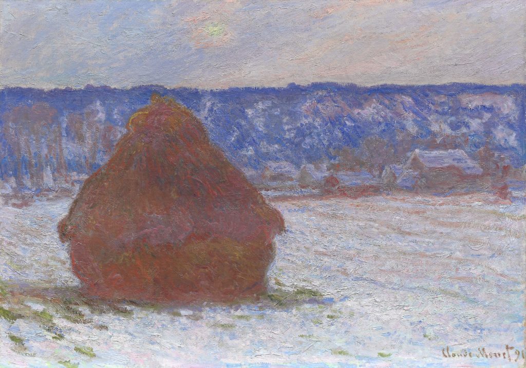
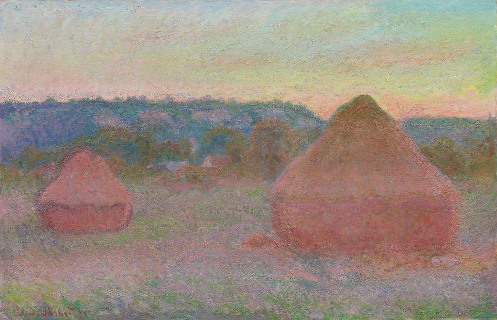
At the request of my wife, we spent a decent amount of time studying Claude Monet’s Stack (or Stacks) of Wheat series (1890/91), paintings he produced of the same subject. His study shows the wheat pile(s) on an open field during different times of day and seasons.
Since my wife has worked as a photographer, studying the effects of light and season on the same subject are a part of her ongoing education (as it should be for any visual artist).
I believe some of the best advice on becoming a talented visual artist came from a photographer who once said, ‘Don’t shoot the subject. Shoot the light.’
Although Monet’s medium was canvas and oil, his art was as true to life (if not more so) than any photographer’s. He was committed to the precision of rendering light the same way the human eye experiences it and evoking identical feelings in the viewer as if they happened upon the subject in their everyday life. By painting the identical subject over and over again, Monet proved it’s the light, not the subject, stupid!
Another painting drew us in with its gorgeous rendering of light: Pardon in Brittany (1896) by Gaston La Touche. It shows religious pilgrims in their best clothes gathering to be pardoned for their sins. The pardon was a procession that came after a day of prayer and confession of various transgressions all part of a Catholic tradition.
We were both drawn to the bright yellow and orange flames from the candles carried by the pilgrims. The painting features the huddle of a crowd, candles woven into tight spaces, bursts of color behind a pilgrim’s ear or nestled into the negative space between devotees.
The painting also features a woman, holding a child, in silhouette above the crowd on horseback. The soft coral or pink light reveals the dying day, sun low the horizon as pilgrims wait for one last blessing that will make their lives right again.
Another work not to miss features a celebration of feminine victory: Ad Astra (1894/96) by Axeli Gallen-Kallela. The canvas is framed with a gilded wooden shrine and its subject is a woman with Medusa like hair, arms outstretched upwards in victory, bright yellow moon behind her and the twinkle of stars against a midnight blue sky.
The perfect outstretched victory arms were something we remembered later in the summer when we watched soccer star Megan Rapione stretch out her arms in victory whenever she scored a goal for the U.S. Women’s National Team, on their way to victory to win their fourth World Cup in so many years.
Speaking of victory and goddesses, I did circles around the Bust of Athena (2nd Century) Unknown. The Art Institute of Chicago has an extensive collection of objects from ancient Rome and Greece including items of practical use to the Romans and Greeks such as jars, dishes, mixing bowls, oil containers and coins. This particular item was on loan. The collection also has statuary and busts such as the one for Athena, a patron goddess of Athens and a national icon for all of Greece given a major City is named after her.
Athena was the protector of Athens and the goddess of warfare and wisdom which is why she is frequently depicted with an owl.
The bust at the Art Institute of Chicago prominently features her protective helmet and its beige weathered marble appears similar to the types of busts and statuary I saw when I visited Greece’s National Archaeological Museum. Her wide face, curly hair, full lips, deep set eyes and strong nose (which was evident even with part of it missing) seems typical of the many busts and statues I’ve seen of her both in Greece and in L.A. at the Getty Villa. Greece’s Athena is no delicate flower but a hardened and resolute battle maiden, jaw set, courageously frozen and ready to protect her charges and wage war for the entire city of Athens.
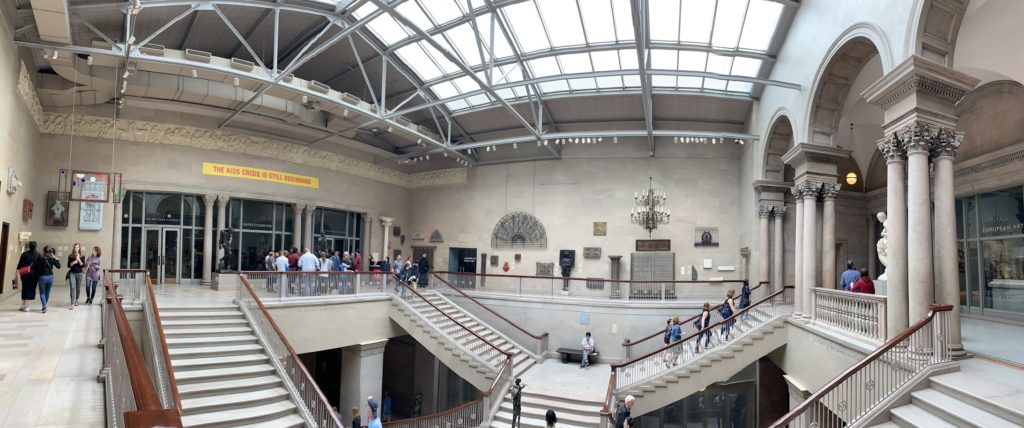
Because of the Art Institute of Chicago’s vast collection, every time you enter a new hallway or round the corner, it’s possible to come face to face with a totally different style, period or geographic region of art. Somehow after we wandered away from the Impressionists and through Ancient Greece, we turned a corner and were in the early 20th century and admiring the work of Frank Lloyd Wright (1867-1959), an American architect and designer who created over 1,000 buildings in his lifetime.
His style is distinctive, American, focusing on clean lines and natural materials, shying away from an ornate European style which was popular during his time.
The Art Institute’s Frank Lloyd Wright collection has a wide variety of pieces, items that were design elements in his buildings: lanterns, grilles, tables, windows, benches and chairs, all items he designed to complement his architectural masterpieces.
Having spent more than a quarter of my life living in Pasadena, CA (an architectural and design haven for Wright, Greene and Greene, Sylvanus Marston and others), I was familiar with Wright’s work and had seen a number of his designs and buildings both in Pasadena and L.A.
So my big question when coming face to face with the Art Institute of Chicago’s collection was what would catch my eye and hold my attention this time?
A stunning 1923 lantern from Wright’s Imperial Hotel in Tokyo, Japan was the answer. The terra cotta and stone lantern with its weathered stone, porus with holes and a primitive delight completed my meditation on the simplicity of great design. It’s weathering and look reminded me of the great stone work I just saw with the Bust of Athena. And just as timeless.
With contemporary design in America focused on natural colors and primitive stone, Wright’s lantern was another example of art or design that connects the past to this present age. As I studied the warm glow coming from the lantern, I felt if Wright never existed in his own time, but was working as a young architect today, his influence and impact would be just as potent in contemporary America as it was at the turn of the last century.
I could even imagine him tackling the tiny design movement coming up with multi-functional furniture for cracker box sized apartments in Brooklyn.
Although I was fascinated with the lantern, there is so much to see and appreciate in the Art Institute’s collection of his work such as the Francis Apartments: Entrance Gate (1985) and Avery Coonley Playhouse: Triptych Window (1912).
After checking out Wright’s work, my wife and I decided to dive deeper into the Art Institute’s collection from the 1900’s and on. We were delighted to stumble into a whole area devoted to the work of Georgia O’Keeffe (1887-1986).
Having loved her work for years, I sought out every opportunity to see it: from special exhibitions at museums in the L.A. area to taking a visitor’s tour at the Georgia O’Keeffe Museum in Santa Fe. Although I was grateful for every past opportunity to see her work, I usually left feeling a bit disappointed and with some questions.
“Where was Yellow Hickory Leaves with Daisy (1928)? Where was Red Hills with Flowers (1937)? Where was Cow’s Skull with Calico Roses (1931)? Or how about Green Mountains, Canada (1932)?” One breathtaking turn into a gallery at the Art Institute and all my decades long disappointments evaporated. There they were, hanging in all their glory, the art work that I bought many times on postcards and as prints, but nowhere to be found in all the previous museums or special exhibitions I visited. ‘Hey guys, I bought your print swag, your scarves, your coasters, where’s the actual painting?’
They were here all this time, all of my favorites, living near the Magnificent Mile in the stunning permanent collection of the Art Institute of Chicago. A couple of hours visiting the Art Institute and it becomes abundantly obvious why it’s considered one of the greatest museums in America. No one can touch the breadth of this collection.
While I felt my heart sore studying the swirls of paint from O’Keeffe’s brush, feeling young again. I also took another tour of my youth when I jumped 50 years into the future and viewed large scale prints of Cindy Sherman’s (1954-Present) photographs from the early 1980’s.
Her work inspired me during my college coming out phase when she was doing her early work. I found strength in her portraits of women which were self-contained, internal, looking away from the camera and not trying to please or placate the viewer, a radical concept at the time given “women as props and appendages” in a lot of contemporary photography at that time. As a young photographer, Sherman sold a lot of her work to queer publications that appreciated her sensibility as a feminist who valued women in their own right, not having to be or do anything for anyone but themselves.
I remembered her photographs for years after seeing them in print magazines. One of her portraits looked like one of my first girlfriends. So it was an incredible experience to see the exact photos i appreciated as a young college student as full sized prints. Staring into the soft glow of these portraits I felt the invincible summer of being 19 again.